Photoshop Tutorials: Free Stock Media #2 plus 9 more | |

- Free Stock Media #2
- Turn a Regular Headshot Into a Cold Winter Portrait
- “The Pain” – Create this Eerie Abstract Photo Manipulation
- How to Create a Stunning Winter Princess Artwork in Photoshop
- How to Create a Surreal Scene with an Invisible Man Inside a Mystic Cave
- How to Create an Odd Looking Cityscape in Photoshop
- Freebie: 12 Seamless Flat Rock Textures
- 16 Awesome Negative Space Illustrations by Tang Yau Hoong
- How to Create a Violin Player in a Grassy Landscape
- 19 Massively Detailed Illustrations by Shi Chun
| Posted: 07 Aug 2012 12:58 AM PDT PhotosIllustrationsVideoAudioWebOthers
|
| Turn a Regular Headshot Into a Cold Winter Portrait Posted: 06 Aug 2012 12:47 PM PDT Preview of Final Results
Download the PSDWinter Portrait.zip | 9.43 MB Winter Portrait Photoshop TutorialTutorial Resources
Step 1Open a new file, in this case I used 940x 1200 pixels, since the image is just a portrait, that resolution is great.
Step 2Let’s select the models skin with the lasso tool. Don’t worry about been perfect cause then you can use the eraser in the edges of the image.
Step 3After the selection is made you have to press CTRL + J to duplicate the skin. So then you are gonna have a new layer like this:
Step 4Then you have to apply a surface blur filter, to make the skin softer. For this you have to go to Filter -> Blur -> surface blur-> and then add 8 for radius and for threshold.
Step 5Then desatured the skin’s layer a little bit like -30%. Press CTRL + U to see the menu.
Step 6Use the patch tool to erase the hair that is on the model’s lips.
Step 7After removing all those imperfections, use the lasso tool to select the model’s lips, and duplicate the layer pressing CTRL + J. Remember that doesn’t matter if it not perfect you can always used the eraser close to the edges.
Step 8In the layer you duplicate apply multiply with 50% of opacity and 80% of fill, to make the lips darker.
Step 9Press Ctrl + j to duplicate the lip’s layer once again. In this case use the layer mode in soft light at 60% of opacity. that will make the lips look shining.
Step 10Now we are going to work in the eyes. Go to the layer of the model’s skin and select the eyes with lasso tool then duplicate the layer CTRL + J.
Step 11Press ctrl + u to change the color of the eyes. I used hue at 200 to make the eyes blue.
Step 12Duplicate the eye’s layer and use the layer in color dodge option at 70% of opacity to achieve this look.
Step 13To do the blush I created a new layer and paint the model’s cheeks with a soft brush, using a pink tone.
Step 14Apply Gaussian blur filter at 60% to make the blush look more natural.
Step 15Put the layer in multiply with 50% of opacity and 80% of fill.
Step 16To make the model’s makeup I apply blue eye shadows. So to make this create a new layer, press shift+crtl+N. then choose a dark blue violet in the palette, and paint the models eye with a soft brush.
Step 17Apply Gaussian blur filter with a 8.0 radius. and then put the layer in multiply. you can choose to make the eyeshadow look darker or softer changing the opacity of the layer as you prefer.
|
| “The Pain” – Create this Eerie Abstract Photo Manipulation Posted: 30 Jul 2012 12:47 PM PDT Preview of Final Results
Download the PSDThe Pain.zip | 28.04 MB The Pain Photoshop TutorialTutorial Resources
Step 1Create a new document, choose the size with1333x1000 px and fill it with white ( or any sizes and any colors you like).
Open grunge texture 1 stock. Use Move Tool ( press V to active it) and drag it into our main document, resize it as shown below:
Choose Edit-Transfrom-Flip Horizontal:
Then press Cmd/Ctrl+Shift+U to desaturate this texture. You’ll see it turns into black and white:
Step 2Open grunge texture 2 stock. Drag it into our canvas and do the same technique in step 1 ( resize, transform, flip it). You may notice that I only use the center part of this texture for this tutorial:
Change the mode of it to Multipy 50%:
Step 3There is a part on background that I want to fix. It’s a carved circle on the right edge. Create a new layer ( hit Cmd/Ctrl+Shift+N to do it) and press S to active Clone Tool. I use this tool with settings below :
Hold the Alt key on the part of source then clone over this circle. If you’re not familiar with this tool you can follow many good tutorials over the web. Here is my result:
No need to be so cleaned with it as we’re working on grunge background! After cloning this part becomes a bit blurred. Don’t worry, you just need to sharpen it. Go to Filter-Sharpen-Unsharp Mask:
Step 4Now we’re going to add splatter effect for background. Create a new layer and set foreground color to black. Choose dried blood splatter you’ve downloaded and take one for your taste and draw on background. You can see my choice of brush:
Move it to the top of picture and change the mode to Soft light 100%. Depending on the boldness of brush you can vary opacity or even duplicate it to get the effect you want.
Step 5Make a new layer and I use the first brush of brush pack to continue painting on the left side of background and I set the mode of it to Soft light 50%. Then I duplicate it and move it to the right.
Continue with two layers ( or number of your choice) and draw some small splatters. I set one layer to Soft light 50% and another to 100%. You can add layer mask to erase any unecessary parts:
|
| How to Create a Stunning Winter Princess Artwork in Photoshop Posted: 23 Jul 2012 12:47 PM PDT Preview of Final Results
Download the PSDWinter.zip | 45.41 MB Download from Website Winter PhotomanipulationResources
Step 1 – BackgroundOpen the ‘Background 1′ image and let’s crop the part we are interested in.
Duplicate the image and set it to Multiply. Opacity 80%.
Open the ‘Background 2′ image and put it above the other layers. Delete the part with the tree (as you see below).
Set the layer to Soft Light. Opacity 50%. As you can see on top there is a part of the tree that is not well belended. Delete it with the Erase Tool or with a Layer Mask (I prefer this method because it doesn’t destroy the image).
This is what you will have.
Create a new layer. Choose a big round soft brush with low Opacity and pick Black color. Paint a vignette like the one you see in the image below and add Gaussian Blur if you want.
Set the layer to Multiply. Opacity and Fill to 80%.
We need to create a kind of ray of light. Create a new layer. You can paint it with a soft brush or use a light beams brush like this.I used this color: #ccdffb (The black background is only to make you see the light, you will not have to do it!)
I left the layer with Normal Blend but I put the Opacity at 80%. Double click on this layer and a window will pop up. Check ‘Outer Glow’. Put the color #ccdffb instead of the preset yellow.
Step 2 – LadyExtract the Lady and put her above every layer in the position you see below. (I previously worked on her skin with the Smudge Tool and liquified a bit her face).
Add a Hue/Saturation only for the lady’s layer and set the Saturation to -60.
Create a new layer below the one with the Lady. Load the ‘Smoke’ brush and with color #999da3 paint something like the image below.
Set the layer to Linear Dodge with Opacity and Fill at 50% and this is what you’ll have so far.
Create a new layer linked only at lady’s layer (above the hue/sat we created before). Choose a soft brush with low Opacity and Flow. Pick the color #cad7e7 and paint some light at the edges of the lady.
Create a new layer above everything and let’s paint some hair to give it volume.
|
| How to Create a Surreal Scene with an Invisible Man Inside a Mystic Cave Posted: 16 Jul 2012 12:46 PM PDT Preview of Final Results
Surreal Scene Photoshop TutorialTutorial Resources
Step 1: Create a new Photoshop FileCreate a new file in photoshop using these settings:
Step 2: Add the CaveOpen the cave stock and select the cave using the Quick Selection Tool (Shortcut: W). Here's a few tips on how to make selections with the Quick Selection Tool, you'll use them a lot throughout the tutorial:
The result of my selection is painted with red in the image below (I'll always show my selections painted in light red).
Copy and paste the cave into our project and use the Free Transform Tool (Shortcut: Ctrl/Cmd+T) to adjust it in our project (see image below).
Now select the Rectangular/Marquee Tool (Shortcut: M) and make a selection on the top blank space of our image (see image below for reference).
Press Shift+F5 to open the Fill window and select Content-Aware.
And here is the result:
To fix some problems with the edges, Hold Ctrl/Cmd and click in the thumbnail of the Layer 1.
Then go to Select > Modify > Contract and set the contract value to 5px.
Reverse the selection by pressing Ctrl/Cmd+Shift+I and then hit Delete to erase a little bit of the edges. You probably won't be able to see the results in the image below, but If you followed the steps correctly your edges should be fixed now.
Now make a selection of the left side of the cave using the Quick Selection Tool (Shortcut: W), then copy (Ctrl/Cmd+C) and paste (Ctrl/Cmd+V) into our project.
With the Layer 2 selected, go to Edit > Tranform > Flip Horizontal.
Select the Move Tool (Shotcut: V) and move the cave part (Layer 2) to the right side of our image.
Now let's erase the part of the cave we don't want. To do that, select the Layer 1 and use the eraser (Shortcut: E) to delete the red part of the cave in the image below. Here are some notes when dealing with brushs:
Go back to the Layer 2 and erase some areas as well (see image below for reference).
Your result should be similar to this:
Select both cave layers (Hold Shift and left click on them) and merge them in one layer (Ctrl/Cmd+E). Then, double click the name of the new layer and change it to Cave.
Let's fix the colors of our cave now. In the Layers pannel, click in 'Create a new Fill or Adjustment Layer' and select Curves.
Adjust the curves like this: You can also use the Output values in the image below as reference while adjusting the curves
And the cave is done! It should look like this now:
Everytime you add an adjustment layer that you don't want to affect all of your layers (just the first layer below it), you need to clip it to the that layer, like this:
Now to clean our workspace a little bit, select the Cave and the Curves layer and add them to a new group by pressing Ctrl/Cmd+G. Name the new group Cave.
Step 3: Add the DesertOpen the Desert stock and use the Quick Selection Tool (Shortcut: W) to select it.
Copy (Ctrl/Cmd+C) and paste (Ctrl/Cmd+V) the desert into our project and place its layer below the Cave group.
Use the Free Transform Tool (Ctrl/Cmd+T) to resize the desert without losing the proportion. Here are some tips for this tool:
Add a Curves adjustment layer like we did with the cave and see the image below for the input values. Like we did before, clip this adjustment to the layer below (the desert layer). Always remember to clip an adjustment layer to the layer below it (if you don't want it to affect any other layer)
Here is the result of this curves adjustment:
Add a Color Balance Adjustment Layer and see the image below for the input values. Remember to also clip it to the desert layer.
Your image should look like this now:
Select the desert layer and its adjustment layers and add them to a new group called Desert (Ctrl/Cmd +G).
Step 4: Add the first underwater stockOpen the Underwater stock (first one on the list), press Ctrl/Cmd+A to select the whole image and copy (Ctrl/Cmd+C) and paste it (Ctrl/Cmd+V) into our project.
Use the Free Transform Tool (Ctrl/Cmd+T) to resize and stretch the ocean. Just click and drag the squares in the edges (you don't have to hold Shift this time) until you have something like this:
Now add a layer mask to this layer and start painting following the image below. Here are some tips when painting a layer mask:
And here is the result:
Step 5: Add the second underwater stockOpen the underwater stock 2, press Ctrl/Cmd+A to select it all, copy (Ctrl/Cmd+C) and paste it(Ctrl/Cmd+V) into our project.
Press Ctrl/Cmd+T to resize and stretch this new underwater stock like we did with the last one.
Like we did with the other underwater image, create a layer mask to this layer and paint (Shortcut to the Brush Tool: B) it following the image below.
Here is the result:
There are some stains in this stock image and we're going to fix it now. Select the Spot Healing Brush Tool (Shortcut: J) and just start clicking the areas you want to fix.
Here is the clean image:
To add the surface of the water, we're going to go back to the second underwater stock we used and make another selection. Use the Rectangular Marquee Tool (Shortcut: M) to draw this rectangle:
Copy and paste it into our project. Place this layer right below the Cave group and use the Free Transform Tool (Shortcut: Ctrl/Cmd+T) to resize and stretch it.
Here is what your ocean should look like now:
|
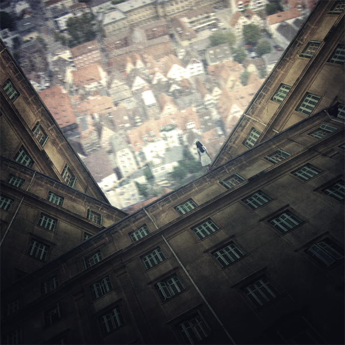
| How to Create an Odd Looking Cityscape in Photoshop Posted: 09 Jul 2012 12:47 PM PDT Download the PSDHow to Create an Odd Looking Cityscape in Photoshop PSD.zip | 242.32 MB Preview of Final Results
Odd Looking Cityscape Photoshop TutorialTutorial Resources
Step 1: Create a New Photoshop Image FileNow, let’s start by creating a new image file, go to the Menu bar and click File > New, and then input the following values on their respective fields:
Step 2: Create a city as seen from aboveWe will start off by creating a city from aerial view. To start, let’s open “Looking down on Ulm” by Zhonk. Once the stock image is open, activate the Move tool by pressing V on your keyboard and left-click on the image and drag it to our 3000x3000px canvas. Once on the canvas, position it as shown below:
Step 3Next, rename this layer to “city”. To rename a layer, simply double-click on the words: “layer 1″ (you can find that on the layer window) to prompt a text box to appear.
Step 4Next, we will resize the city. To do that, activate the Transform tool by pressing Ctrl/Cmd + T and then resize the city layer as shown below:
Step 5Now that we had resized the city layer, it is now time to give it motion blur effect, to give the viewer the illusion that this city is actually moving. To do that, left-click on the “city” layer and then go to Filter > Blur > Motion Blur. Once activated, input the following:
The result should be similar to the following:
Step 6Next, we will create a glary haze over the city layer to produce the illusion that it is far away. To start, let’s create a new layer over the “city” layer, by left-clicking on the “city” layer and pressing Ctrl/Cmd + Shift + N. Doing this will automatically create a new layer over our “city” layer and a box will appear asking several details, but the only important thing is to give it a name. Input “haze” on the name field.
Step 7Now, that that’s done, we will now activate the Brush tool (B) but then let’s make sure that the active Brushes are the default brushes. The default Photoshop brushes are shown on the image below, if that’s not what you see, then follow the instructions below:
Right click the canvas while a layer is selected and while the Brush tool (B) is activated and then click on the button highlighted below:
Then click on “Reset Brushes” from the contextual menu.
Now, that that is done input the following settings for our Brush tool (B):
Note: The #: ffffff is the color of the brush. To change it to that, simply do the following:
Once the Color Picker box opens, input the following on the # box:
Now, we’re all set to paint, use the brush as shown on the image below:
The result should be similar to this:
Step 8Now that we’re done, group all the layers that we’ve created by selecting all the layers and pressing Ctrl/Cmd + G. Once grouped, rename it to “City from above”.
Step 9: Create the Weird BuildingsNow, we will be adding the oddly positioned buildings. To start let’s open the stock image – “Old buildings with green windows” by lucianont. Once opened, activate the Polygonal Lasso tool by pressing L on your keyboard.
Use the Polygonal Lasso tool (L) to select the outline of the building.
Now, that you’ve created a selection area around the building. Activate the Move tool (V) and drag the selected building to our canvas. Once on the canvas, rename this layer to “building”. Now, position it as shown on the image below:
Next, activate the Transform tool (Ctrl/Cmd + T) and then resize it as shown below:
The result:
|
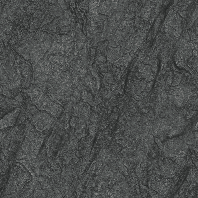
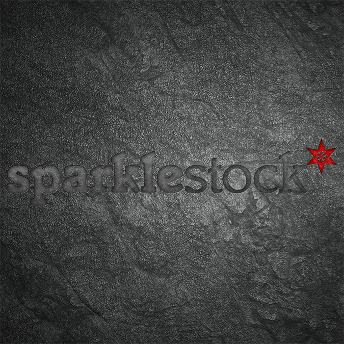
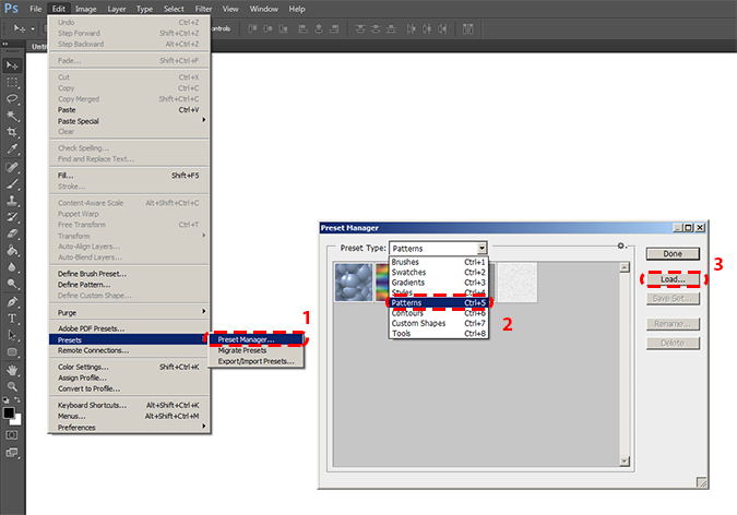
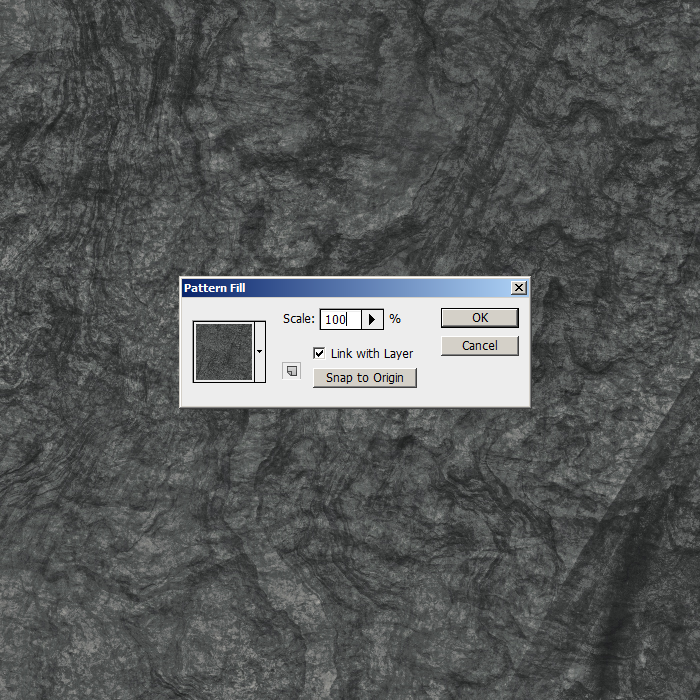
| Freebie: 12 Seamless Flat Rock Textures Posted: 30 Jun 2012 12:47 PM PDT Seamless Flat Rock Textures
How to Load Patterns into Photoshop
There are a few ways to add patterns but the easiest is to add a Pattern Fill Layer. To do this, go to Layer > New Fill Layer > Pattern.
Download Photoshop PatternsSeamless Flat Rock Textures (12 Variations) Seamless Flat Rock Textures (55 Variations)
|
| 16 Awesome Negative Space Illustrations by Tang Yau Hoong Posted: 25 Jun 2012 12:47 PM PDT Interview with Tang Yau HoongHi Yau Hoong! Welcome to pstutorials.ws! Can you tell us something about yourself so we could get to know you better?I am a 27 year old illustrator/ graphic artist based in Kuala Lumpur, Malaysia. I hope to make graphics that spark the viewer. As a graphic maker I try to convey messages visually.
What made you pursue visual art and graphic design? How did you train for it?I am self-taught and I learned from mostly looking at other artist’s work of any form. Few years ago I started submitting designs to online t-shirt design contests. It was the beginning of the journey and I hope I can keep on pursuing it.
Malaysia is a place that is rich in tradition and culture. Does this environment influence your aesthetics or inspire your work in any way?In terms of aesthetics, not very much. In terms of thinking and concept wise, yes. The multicultural aspect has helped me to learn different things and be open to various points of view.
Is there any artist that you look up to and inspires you?I find inspirations from various artists and designers. Rene Magritte, Shigeo Fukuda, Saul Bass, Christoph Niemann, Banksy, Michel Gondry, Rinko Kawauchi and many more.
Can you tell us about your style? You have such an ingenious way of using negative space in your illustrations. How did you develop this kind of style?I have no idea how I developed this kind of style and probably it is not done on purpose. I always love simple designs with strong concept.
How does a concept come to life from start to finish? And how long does it take you?There is no standard work flow but most of the time I am doing the thinking part rather than illustration part. It can take up to weeks but it can also be done in a day. I do a lot of roughs on paper and if I am lucky, the idea will evolve into something I like.
Can you tell us about Journey to the City of No Horizon? What was the concept for this work?It is about negative space and surrealism and it marked the beginning of my illustration style. The concept is open-ended. City, flow of life, surrealism could be the themes.
Are there any projects that the readers should look out from you?I love doing personal projects and will be posting new work incorporating negative space and surrealism.
Lastly, any message for our readers?Thank you for reading this and I hope you enjoy looking at my work.
More about Tang Yau Hoonghttp://tangyauhoong.com/
|
| How to Create a Violin Player in a Grassy Landscape Posted: 25 Jun 2012 11:56 AM PDT Preview of Final Results
Violin Player in a Grassy Landscape Photoshop TutorialTutorial Resources
Step 1: Create a New Image FileCreate a new 3500×3500 pixels document (File > New).
Step 2: Create the BackgroundFirst off, let’s open the calm field in Photoshop. We will be using sky from this stock image so we will need to transfer it to our main canvas.
Click the calm field and press M to rectangular marquee tool and make a selection around the sky. Now activate move tool (v) Left-click the image and drag the image to the main canvas and change layer name to “sky”.
The result should be similar to this:
Step 3Activate transform tool (Ctrl+T or Edit > Free Transform) then scale the mage as shown below:
The result should be similar to this:
Step 4Open the Sunny Field image in Photoshop. We’ll be using the grass field from this image.
Use the Rectangular or Ellipse marquee too to create a selection like shown in the image below. Copy and paste the selected area into our main document. Rename the new layer to “Ground”.
The result should be similar to this:
Step 5Use the Transform tool (Ctrl+T or Edit > Free Transform) to scale the image like shown below.
The result should be similar to this:
Step 6Select the Eraser tool the input the following settings:
Erase the area shown in the image below.
The result should be similar to this:
Step 7Now create new Color/Balance adjustment layer from the bottom of layers palette.
Press Alt+left click in between 2 layer’s (sky layer and Color/Balance) to make a mask.
When the Color Balance box opens, input the following:
The result should be similar to this:
|
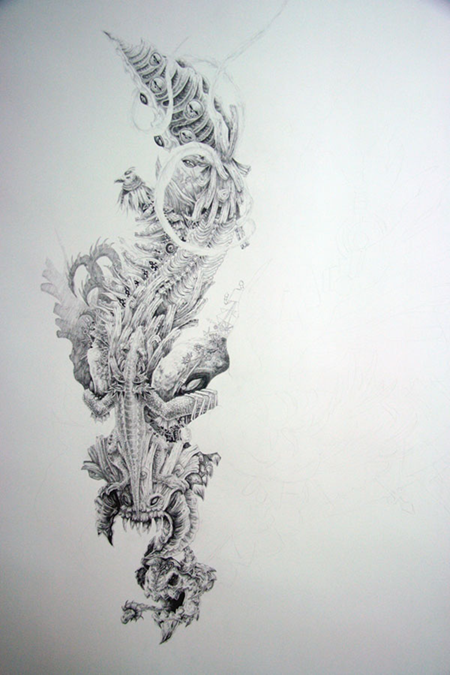
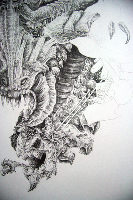
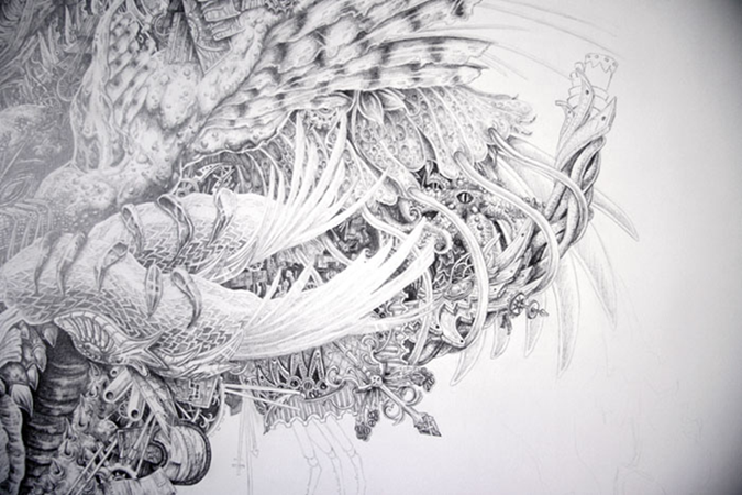
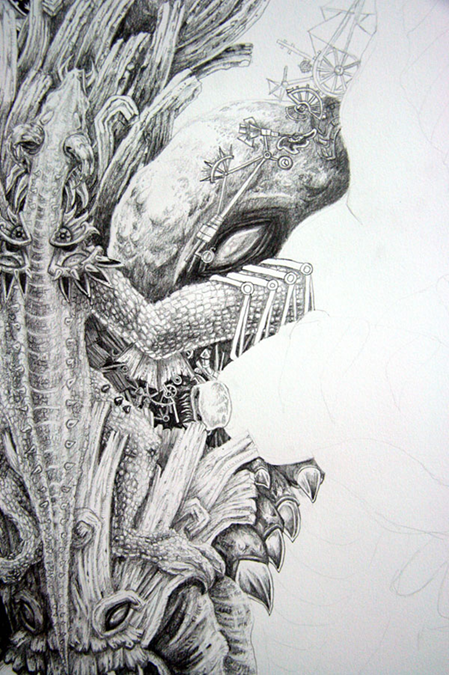
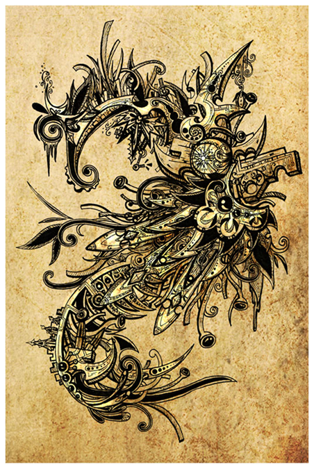
| 19 Massively Detailed Illustrations by Shi Chun Posted: 20 Jun 2012 05:54 PM PDT Interview with Shi ChunWhat are your plans after finishing your degree?My plans are kind of fuzzy but generally in the direction of completing some personal projects while working on some freelance work and hunting for a job. Singapore’s culture does not exactly encourage taking time off for self exploration and finding one’s way in life. It is expected that one finds a job as soon as possible right after graduating so there is that constant pressure from my parents.
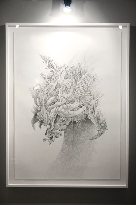
Bestiarum Vocabulum is such an amazingly detailed work! Can you tell us the story behind this project?Haha thank you so much! I’ll try to keep the long story as short as possible. We were given the freedom to work on “anything we wanted” for our Year 4 Final Year Project (FYP). I simply went into it not having the slightest idea what I’ll end up with but thinking I really just wanted to draw creatures. I love fantastical creatures! Dragons, especially. It’s probably one of the few things I’ve been obsessed with since I was a kid. That said, I actually doubted my own skills for most of the FYP which had caused my mentor and I much frustration. I would describe the process of the whole project something akin to fumbling in the dark damp fog, occasionally tripping over rocks, bumping into trees and sometimes I’d spot certain sources of light only to snuff them out with my own hands. After a few months, my mentor said to me, “don’t think, just draw”. The thing was, I was afraid of the blank canvas. I was afraid that I could not live up to my expectations all the time. After that, I tried to churn out as many creatures as I dared, although not nearly enough. Months before the graduation show, my mentor told me, I should do something big but retain all the small details as I had in my A4 and A3 drawings. I wanted to reject the idea but he was right, that’d make an awesome product out of this entire project. As cheesy as it sounds, one day as I was drafting ideas for the big piece, inspiration hit me. Up til then I had been thinking of how I’d draw one creature, but what if that one creature is made up of many. Paying homage to the dragon came naturally. Piecing all the small creatures together was really a fun, irritating and rewarding experience all at the same time. After the final draft was done, all that was left was to draw it on the large canvas. At the end I hope I’ve created something that’ll inspire others as much as others have inspired me with their mind blowing works since I was young. I hope that was a good summary haha. I’ve never been that good at it in my English exam papers.
How long did it take you to finish this?The whole FYP was roughly 10 months long. If we’re talking about what can be seen in the final show, it’d be about 4 months from conceptualization to completion. The large drawing itself took up 2 months.
What made you pursue graphic design? Was this a childhood dream?Honestly, graphic design was not a childhood dream. My childhood dream was to own a pet dragon, haha. My parents noted I had an interest in drawing when I was young and signed me up for weekly drawing lessons but little did they know I’ll eventually continue for roughly 7 years. My interest lies in seeing how the little strokes, lines and curves on a canvas eventually come together to form a visual that everyone can enjoy. Now will be a good time to quote the overused quote, “a picture speaks a thousand words,” that is not limited by language. Visual Communication was as close to what I can get in Singapore for a degree in something related to what I might want to do in future. I’m not strictly a graphic design or typography kind of person but I did enjoy the many things I’ve learnt in school about them. Life and art should never be restricted to just learning one’s own specific field. Learning more about graphic design and typography allowed me to appreciate what goes on inside a canvas even more and also distil the essences of the thoughts and processes behind working on visual communication projects.
What usually inspires you to create?Music! I can never work without music. I’m not one that restricts myself to only a few genres. And also things I see in everyday life and the internet. They mesh up together somewhere in a dark room in my mind and outputs ideas that I’ll consciously go through. I enjoy rolling ideas I have around in my head and see what they can snowball to, though it becomes a problem when I think too much about an idea and leave myself too little time to execute it. I tend to switch around between working with ideas that revolve around more thinking and ideas that revolve around less thinking and more technical to keep the mind fresh and happy. Ah of course, gaming impacts not just my art but life too. The influence from games in some of my works can be easily traced.
You create different projects through a variety of mediums. What medium/materials do you most enjoy working with and why?The digital age can create so much more with the power of digital mediums, it’s amazing. I’m starting to try and get myself more involved with digital mediums but currently I still enjoy working with non-digital mediums more probably out of habit. Pencils and pens are among my favourite tools although lino block prints do make a strong fight for that position too. There’s certain peace and excitement when I’m neck deep in concentrating on working on a piece of work that I can touch. It’s a certain feel about the tactile experience of working with non-digital mediums. Perhaps I am just old-fashioned haha. When it comes to colours, I’d say watercolour is my favourite although I’m less apt at it. There is something very beautiful about the translucent and transcient feel of watercolours especially in capturing sceneries or fleeting moments.
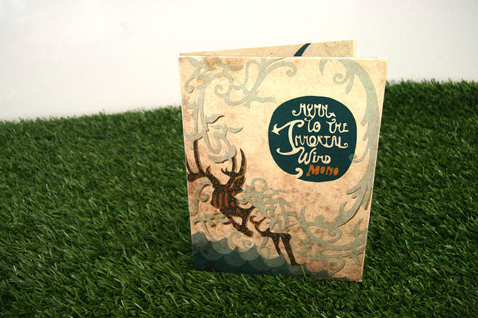
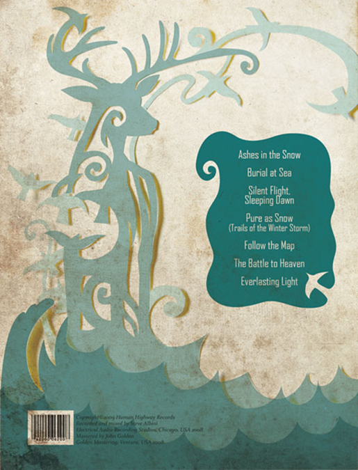
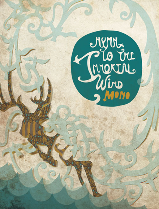
Can you tell us about the design you made for your school assignment (album cover for Mono)? Why did you choose this design and can you tell us your work process for this piece?Before the assignment, I have never heard of Mono or their music before. When I obtained the album from my friend, I was blown away. I was thinking, how could this be the same instruments that people used to make rock music! The sounds presented were really “epic” and introspective at the same time. I imagined that I was standing before an endless horizon of a sparkling sea and the air was full of energy that was fierce at times and quiet at others. I presented some rough initial ideas to my class and one idea was almost unanimously chosen by my classmates. That idea developed to be one of an antelope running across the sea of waves, embracing the world. It will be bold and it will be elegant. It will be wild and it will be serene. Using paper cuts was almost the perfect solution. It could display a sense of fragility yet when you start to play with the form of papers and stack them up, there is suggestion it could be more than what it seems. That captured the essence of how I feel when I listen to Mono’s album. I tried a few different ways of playing around with the paper before the final design came to be. From there the colours and final design of the abstracted form of the antelope, birds and sea pieced together naturally. The final touch was the illustration of the album name which came unexpectedly as I had thought of using existing fonts beforehand.
Are there any projects that the readers should look out from you?Haha nothing really concrete at the moment although I did start a simple web comic on gaming and nerdy stuff recently that I hope to continue for a long time. I really enjoy doing little works that brings a smile to people out there that I do not know and may never know in my life. I’ve been very occupied with the Avengers and Diablo III lately, so my new projects could very well be inspired from these sources. I’d organise and upload the other creatures I did earlier in my FYP that I feel deserve to see the light soon on my Behance profile. So that’s at least one thing to watch out for
Lastly, any message for our readers?I wish to quote Neil Gaiman here in his recent speech. Whatever good or bad situation you find yourself in, “make good art.” I can’t believe how much that 3 words can pack such a powerful message. Additionally, finding out what you’re really passionate in or care about is very important. Only when you find something you really want can you actually change and start to really move forward in life. All my life I’ve only found out what I do not wish to be and I’ve hardly budged at all, even now. I wish everyone all the best in their journey in life and never forget to be happy and appreciate everything around us.
More about Shi Chun
|


")


 b
b


| You are subscribed to email updates from Photoshop Tutorials To stop receiving these emails, you may unsubscribe now. | Email delivery powered by Google |
| Google Inc., 20 West Kinzie, Chicago IL USA 60610 | |
No comments:
Post a Comment